Strobist: Cooking Light Assignment
Okay ... so take what you've learned and apply it. Why is it so easy to forget?
The Assignment: ... photograph one or more kitchen utensils - knives, forks, spoons, whisks - whatever you like. The look you are going [f]or is that of ordinary object elevated to high art. Or at least commercial art, as this is the kind of thing that might appear as a catalog cover or in a calendar or on the wall of one of those ubiquitous "fast casual" restaurants.
The first piece of advice was something I unconsciously ignored: keep it simple.
I'm not sure why I started by over-thinking but I did. There always seems to be at least two ways to accomplish just about everything. Sometimes I start with sketching, formulate some image. Have a plan. Work loose and noodle until it's clear. Or because of computers, we tend to work tight, manipulate tight imagery into an even tighter image often times forcing the issue and achieving no real expression.
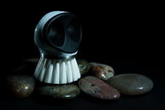
My first attempt is the perfect example of working too tight and forcing the issue. Here ... take a look and I'll explain.
 See Setup Here
This is a pretty nice image but really says very little of the assignment. I didn't plan or even noodle around awhile. I found this interesting shape with this vegetable brush and some pretty rocks. Completely unrelated unless I'm using the brush at the end of a fly-rod. That's not to say that the combination isn't workable, just not in this context. And the result says I took some stuff and lit it with some stuff that I've been trying to find more uses for. It was a lazy, inexpressive attempt.
Well ... at least it was late enough that it garnered little attention.
Version 2 is a nicer image. It is simple, direct, and actually uses the principles that I learned in the first two exercises from Lighting 102. Here ... take a look.
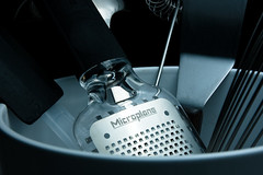
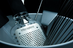 This is a much nicer image. In fact, so much better that I did two versions of it. The two are virtually the same except for the material that was used to diffuse the light. In the first one I was using a PhotoFlex Light Disc and in the second I found and used this huge roll of white paper (almost as heavy a butcher paper without the coating on one side). The only change I had to make between the two materials was to increase the output of the flash from 1/32 power to 1/8th.
The second image seems to hold a little more detail. The light is still hot on the "MicroPlane" text yet seems smoother in the second image. See Setup here.
i shoot nikon

